Today, we’re diving deep into the Coach Session Summary Emails to ensure you get the most out of every training session. While our Dashboard App is your go-to for an extensive, deeper data analysis, the Session Summary Emails facilitate quick, informed decisions, allowing for precise adjustments in training strategies. Each part of the report, from Active Participation to Player-specific Insights, is meticulously crafted to provide data that is crucial for optimizing training and player performance.
Receiving the Session Summary Report
Once you’ve synced your session, an immediate email arrives in your inbox. This email provides a comprehensive breakdown of the session’s data. Regardless of whether it was a coach-led session or an individual player’s session, all team members will receive this report.
At the outset of the report, you’ll spot:
- Your team’s name
- The date of the session
- The session’s duration
Next we move into the meat of the report: the key metrics.
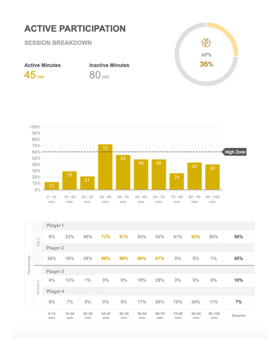
Section 1: Active Participation

Active Participation (AP) highlights the ratio of players’ active time vs. their inactive time, providing a participation percentage for the entire session. The data is further segmented into 10-minute blocks to provide coaches with a structured framework to trace and reflect upon the session’s progression from start to finish. This helps answer questions like – When was the team most active? Who stood out, and who lagged?
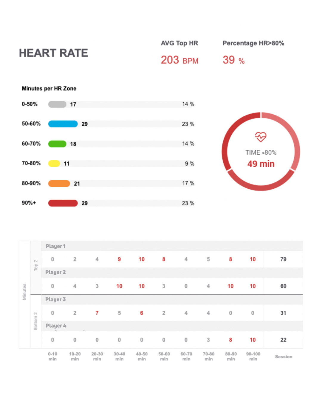
Section 2: Heart Rate

Understand the intensity of your team’s session by noting the time players spend in the Red Zone (over 80% of their max heart rate).Typically, any time over 30 minutes signifies a high-intensity session. Additional insights include the average beats per minute and a breakdown across the five heart rate training zones. As with the other metrics, the top and bottom performers in terms of heart rate are also spotlighted.
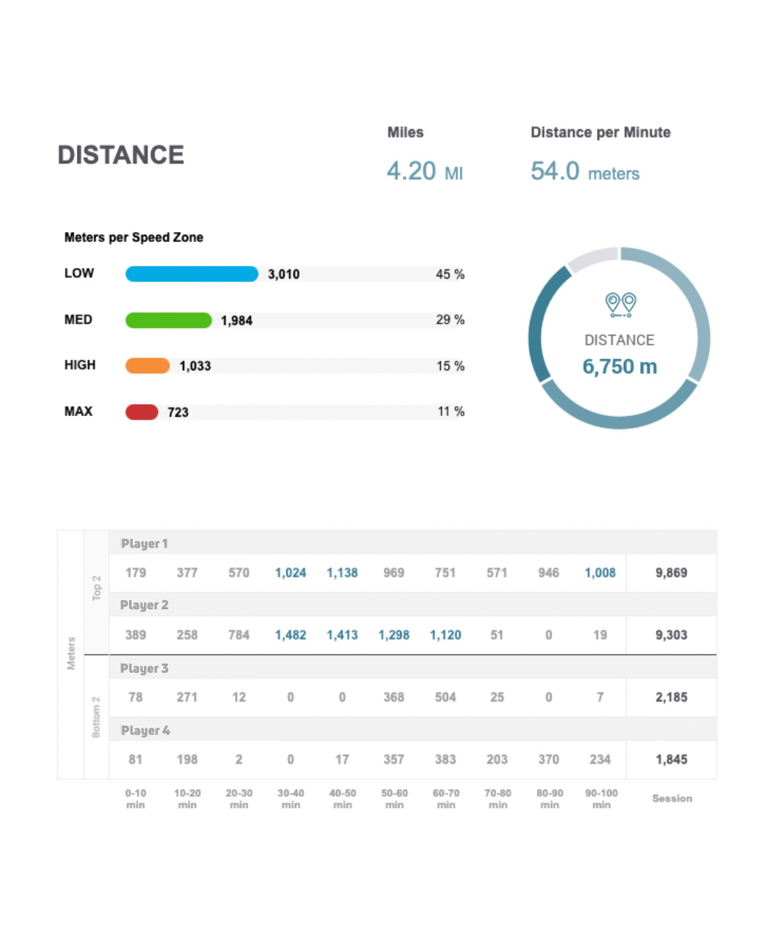
Section 3: Distance

As the name suggests, this metric accounts for the total distance covered by players, showcased both in meters and miles. Plus, get insights on the distance per minute and its further classification into speed zones like low (walking), medium (jogging), high (running), and max (sprinting). Performance data on the farthest and shortest distances covered by players is also available.
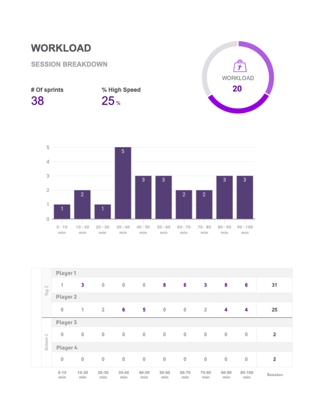
Section 5: Workload

A crucial metric, workload is a numerical representation of a player’s exertion during the session. A higher number implies a more strenuous workout. Critical aspects of this metric include the number of sprints – one of the most taxing activities a player can undertake – and a breakdown of the workload every ten minutes. This metric can give you an at-a-glance understanding of the session’s intensity.
Final Section: Player-specific Insights
At the end of the report, there’s a detailed breakdown for each player, offering an individualized overview. Simply tap the button at the bottom of your report to be redirected to the dashboard for a more detailed reporting.
To wrap it up, the Beyond Pulse Player Session Email Summary Report is designed to offer coaches and players a simplified yet thorough view of their training. By leveraging these insights, you can make more informed decisions, adjust your training strategies, and truly optimize team performance. Happy training!
Check out this full video overview of the Session Summary Report.

 FRA
FRA


